The Clover Clinic
Tools Used: Adobe Illustrator, Procreate
Skills Used: Branding & Identity, Art Direction, Logo & Visual System Development, Vector Illustration, Client Collaboration & Presentation, Inclusive & Accessible Design Practices
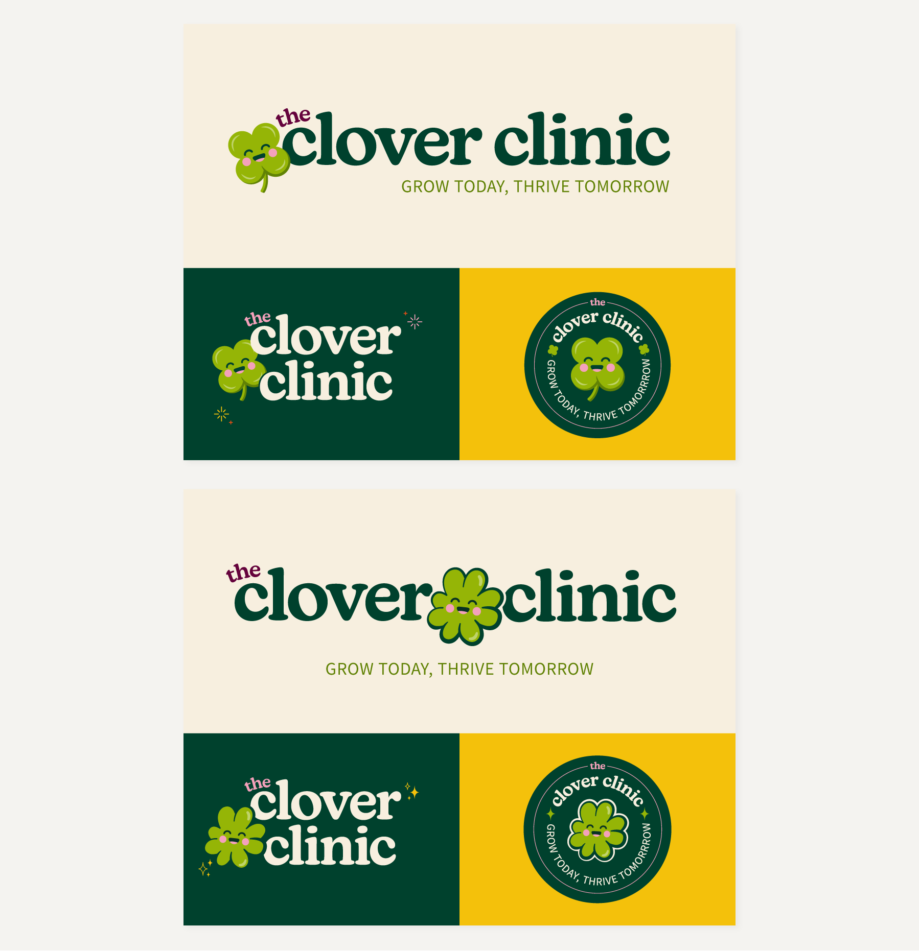
The Clover Clinic is a woman-owned children’s speech pathology practice built around encouragement, growth, and helping kids find their voice. When I began this branding project, the goal was to create an identity that felt warm and welcoming while also feeling playful enough to put children at ease, yet thoughtful and professional for the parents who trust the clinic with their care. To give the client space to explore the brand’s personality, I developed two logos that introduced slightly different mascot styles while still keeping the overall look cohesive and friendly.
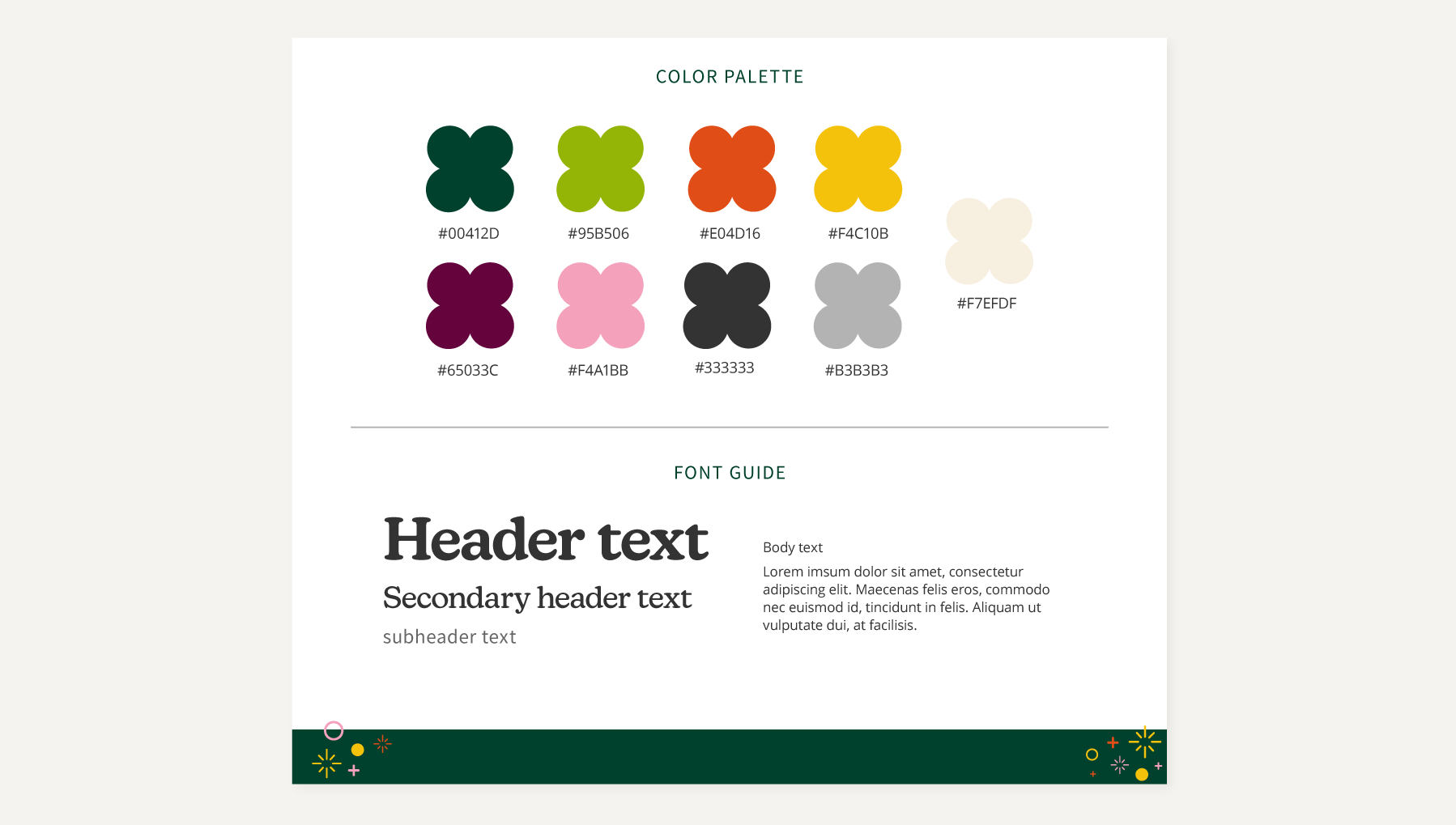
Both concepts center around a custom four-leaf clover character, designed to be a simple and cheerful symbol of growth and support along each child’s journey. I gave the character a gentle, reassuring expression to help clients feel at ease and welcomed. The goal was to make the clinic feel like a place where children can plant roots, feel cared for, and truly blossom. This symbol, paired with soft rounded typography and an uplifting color palette, brings the brand together in a way that feels both inviting and nurturing. All brand colors were also selected with accessibility in mind, ensuring the identity is inclusive and approachable for all families. I believe the final delivery reflects exactly what The Clover Clinic aims to be: a place where kids feel safe, encouraged, and excited to grow.